


Who’s behind art’s dark little secret, Vantablack?
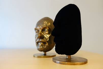
Last spring, in central London, the Science Museum exhibited a face that no one could see. This was not a prank, or some form of psychological concept writ large, but an actual face, a bust around 20cm high and 8cm wide that didn’t much look like a face, because it didn’t much look like anything at all. Sitting in a glass box, in a space that sat as far back on the ground floor of the museum as the museum goes, past the hulking steam turbines in the Energy Hall, past the Eagle lander and the J-2 rocket in the Exploring Space section, past Babbage’s difference engine and the first Apple computer in the Making The Modern World exhibit, past all the past, there it lay, the future, and maybe because of that, because the future is sketched in pencil, it wasn’t getting much interest.
“What’s that?” said one small girl, engaged in the familiar staggered pullback of a hand-led child. “But…” she said, as her father swept her away, “that man doesn’t have a face.”
On the bronze bust, the features were obvious: expansive forehead, bulbous nose, goatee with two breaking waves of moustache – a man of a certain age, frozen at a certain time. On the other bust, the only clue they depicted the same man was the outline – the same broad forehead, the same outcrop of hair from chin.
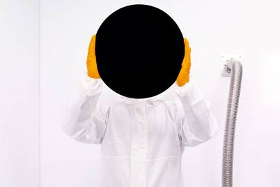
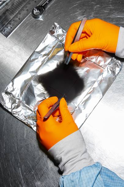
The bust was coated in a material called Vantablack, officially the blackest material known to man, which was developed three years ago by a UK company called Surrey NanoSystems.
A regular matt-black paint, of the kind you’d purchase from a paint shop, absorbs roughly 93 per cent of all light. That’s what makes it black, but also means you can see it. The seven per cent bouncing back makes what’s there there. A black jumper is still clearly a jumper; a black phone still clearly a phone. Even the walls of a teenager’s bedroom, no matter how misguidedly decorated, are very much still a teenager’s bedroom walls.
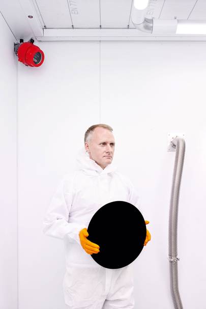
Vantablack, meanwhile, absorbs 99.96 per cent of light. That’s a lot. That jumper becomes abstract (and, bonus, seemingly creaseless). That phone, placed on a desk, would resemble not a phone, but a hole. Stand in a room with all the surfaces coated in Vantablack, and, even with the lights on, it would feel like you’re standing in infinity.
On the bust, Vantablack displayed one of its many curious properties: with virtually no light bouncing back, it gave little clue as to its texture, shape, or even if it was an object in three dimensions at all. This happens below 0.5 per cent reflectance. Face on, it simply looked flat: the man didn’t have a face. It was only side-on that you could even make out a nose.
The interactive information panel below made clear some of the myriad applications for this strange material, but even in the two months since it had been installed, was already interactively out of date. It made clear its applications in space telescopes, allowing them to see further into the cosmos; its uses in military applications; in architecture; in heat absorption. There were already more: in Hollywood; in luxury goods; even in fashion.
In all, it was an invention already worth hundreds of millions, possibly billions, which wasn’t bad for a company based on an East Sussex trading estate next to a Screwfix.
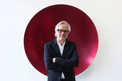
But the main application the exhibit did not mention was art. Earlier that month, in a decision that had courted much controversy, the Turner Prize-winning artist Sir Anish Kapoor – known for his red observation tower, ArcelorMittal Orbit, created for the 2012 Olympic Games – had signed an exclusive deal with the creators of Vantablack to be the only artist allowed to use it.
The outrage of the art world went to the heart of a simple question: can someone own a colour?
In the Science Museum, the girl now came back, roles reversed, arms at full stretch, her father dragged behind. “Look!” she said to him as they came to a halt. “Look! I told you!”
“Oh!” the father said as he crouched down to look at the bust head-on. Then: “Oh…”
“I told you! I told you!” shouted the girl. “I told you!”
“Oh,” repeated the father. Then another pause. “Oh.”
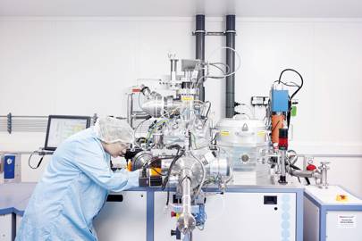
Ben Jensen is 51 years old, slight, thoughtful, close-cropped and the creator of Vantablack. He is the kind of scientist who’s so excited by every sentence he says, he can’t help but break into a grin as he says it, as if he’s a hunter returning with a particularly bounteous catch, or maybe just someone excited by life. His ringtone is a nuclear fallout siren, which is alarming when it goes off next to a reactor that’s replicating the atmosphere of space, and he is a fan of plaid shirts. He is not a hard man to like.
The offices of Surrey NanoSystems, the company he set up and of which he is the CTO, are not, despite suggestions to the contrary, in Surrey. Instead, they are in Newhaven Town, just past County Office Supplies, in a small industrial space at England’s end. It is not a place people go to so much as a place people go to in order to go to other places, via the A26. As Jensen himself says, when I first met him there last summer, “No one has any concept that we’re here, because there’s not much in Newhaven apart from an exit.”
Sitting in the sparse reception room, which houses a table, four chairs and not much else, Jensen says he didn’t set out to create the blackest substance known to man (black holes don’t count: they’re not made of anything). Rather, it happened, as these things tend to, almost by accident.
His career path as a scientist was not a typical one. He couldn’t afford to go to university, so left school at 16, and it was around then that he started making rockets. He’d always been obsessed with fireworks and so decided to create ones with a bit more kick, using rocket fuel that he made himself and begging parts from engineering companies. “Getting liquid oxygen was a problem. I’d phone up these companies saying, ‘Can I buy liquid oxygen?’ They’d say, ‘Why?’ I’d say, ‘I’m making a rocket…'” Brrrrrrr.
It was only when he blew himself up – “There was a crack in the fuel grain… it took chunks out of me” – that he decided to move on. He backpacked around the world, picked fruit and taught himself science on the hoof, reading books such as Rocket Propulsion Elements by George P Sutton, figuring out the equations by himself. In his early twenties, using his rocket knowledge, he invented a way to miniaturise liquid-oxygen plants so they could be used in field hospitals. He found an investor, worked on it for three years and was just about to be certified when the investor died. Back to the drawing board.
He worked in a machine metal shop for a couple of years, making parts for reactors, before deciding he could do a better job himself. “I started teaching myself physics and chemistry,” and before long he was designing and building his own plasma reactors: easy when you’ve taught yourself how. Business, he says, was good.
“I had the ability to convince people I knew what I was doing. I said I could solve their problem and I always delivered… I guess I was lucky in that I had always had to design things creatively and solve things other people hadn’t been able to solve. I think if I’d had a formal education, I might just have believed I couldn’t do it. That’s the philosophy I had as a kid: if no one else has done it, it doesn’t mean it can’t be done. I’ll give it a go.”
The creation of the blackest black may sound like a gag out of Spinal Tap (“None more black…”) but the competition was no joke. Nasa had been trying to create a super-black material for decades, along with another 15 or so companies around the world. It was the holy grail for space telescopes. Space may seem dark, but up there, in our solar system, the sun is blinding: this is not ideal when you’re trying to detect light from stars that are ten million light years away.
The darker the coating behind the sensor, the less pollution from the sun, and the clearer you can see. Previously, a coating called Aeroglaze Z306 was used, which absorbs 97 percent of light. Because the light takes so long to reach us, what telescopes capture is the distant past. The creator of a super-black coating would, effectively, let astronomers see further back in time.
It is not the first time there’s been an arms race to create a colour. The first company to create a convincing chrome paint, it’s widely thought, for use in everything from lightweight airline seats to everyday furniture and architecture, will make a fortune. Yet it’s fair to say the stakes have never been higher.
Nasa had come close, having created a material that absorbed 99.5 per cent of light. Yet it had a fatal flaw: it needed to be coated at such a high temperature (around 750C) it melted pretty much anything except diamond. This, it’s fair to say, was not ideal for space telescopes.
Jensen only happened into super-black materials after the market fell out of the reactor industry, “So I looked around and thought, right, what’s the next big technology that we can do now but no one else can?” This is how Jensen thinks: what big problem can I solve next?
He alighted on nanotechnology and soon found himself working at the University Of Surrey – hence his company’s name – with a professor named Ravi Silva, who headed the Advanced Technology Institute there. It took just two-and-a-half years for him to crack it.
Vantablack isn’t technically a colour or a pigment at all, but rather a molecular trap for light. It consists of something called “carbon nanotubes”. These are pretty much what they sound like: small tubes, around 10,000 times thinner than a human hair, made out of carbon.
Imagine a microscopic game of beer pong: the nanotubes are the cups, the photons of light the balls. When they land in a cup, they rattle around and so don’t bounce back out as light, but are converted, instead, into heat. Score.
“People email in saying, can you coat my supercar?” says Jensen. “And we always say: well, it’s possible, but when you’re driving and the sun comes out, it’s going to get incredibly hot, and people don’t generally want to cook themselves.” (It is also for this reason that the Daily Mail‘s report that Vantablack will be used to coat spy planes is… not accurate).
The few photons that hit the rims, meanwhile, account for the 0.04 per cent of light that bounces back. This is why nothing can absorb 100 per cent of light.
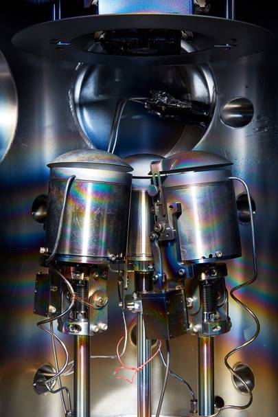
Nanotubes aren’t built, but grown, like blades of grass, albeit ones that grow at a few hundred degrees, take 12 seconds from start to finish and use chemical layers instead of compost.
At the University Of Surrey, they bumped up against Nasa’s 750C problem, but the breakthrough came, in the pub one day, after they’d almost given up, in working out a new way to heat them: from above, not below, almost halving the surface temperature in the process. And just like that, Jensen beat Nasa to the punch. The darkest substance in existence, and one you could shoot into space.
We had top fashion designers and pop stars asking to use it – Jenson
When they first unveiled it, at the Farnborough International Air Show in July 2014, Jensen was expecting to get ten or 15 enquiries. Instead, they were featured on CNN, the BBC, NBC and were inundated for months. Upon seeing it the first time, most people’s reaction was equal parts prosaic and profound: mostly, they simply said it looked like reality had been “Photoshopped”.
Jensen can’t discuss military applications, but it was soon classified by the UK government for exactly that purpose and its uses are not hard to imagine. An infrared heat-seeking sensor on a battleship, for instance, uses a black coating in a similar way that a space telescope does: to focus on what it wants to detect (heat from missiles) and ignore what it doesn’t (heat from the sun). With missiles that fly at Mach 3 – about one kilometre a second – any shaving of automated anti-missile response time could be crucial.
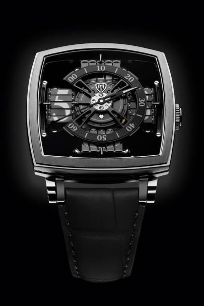
Other applications Jensen hadn’t even considered. Luxury watch manufacturers soon got in touch: could they Vantablack their watches? “Imagine,” says Jensen, “you’ve got a black hole on your wrist…” The first, a $95,000 (£74,000) MCT, came out last year.
Hollywood came calling. Using a Vantablack backdrop for CGI instead of green screen could, potentially, save hundreds of millions of dollars a year. The camera wouldn’t detect the background at all, meaning none of the frame-by-frame tidying currently required in postproduction offices.
There was even a use for it in skyscrapers, which struggle to stop heat rising through the floors. The heat-absorption qualities of Vantablack could solve that instantly.
The fashion industry made desperate pleas. “I think we had five of the world’s top fashion designers saying please can we make something with this?” says Jensen. Some famous pop stars also got in touch: “I can’t say which ones, but you’d know them…”
Mostly, Jensen had to disappoint. He had to explain that Vantablack was not a paint, it was not a pigment, it wasn’t sold in pots, it was not a dye. It was a carbon material that could only be applied in a reactor, in a vacuum that resembles space, by growing it at around 400 degrees. Oh, and it was probably best you didn’t touch it afterwards because nanotubes irritate the skin.
Yet when Anish Kapoor’s office got in touch, Jensen was intrigued. He went to Kapoor’s studio and explained, as he always did, that this wasn’t something that came in a bucket and, no, you can’t wheel a sculpture into a reactor. Yet he found himself nonetheless blown away by Kapoor and his work.
“Honestly, I’m a bit of an art philistine. I know what I like, but I don’t know much about it. But I walked into his studio that day and inhaled my breath. The vision… the way he works with light and shadow and reflection…”
He began thinking what a shame it was Kapoor couldn’t use Vantablack. It spoke to his inquisitive nature: what could be done that no one else has tried?
There were, beyond the obvious limitations, some benefits for an artist. Vantablack had such a low density, for instance, it was almost air: 99.9 per cent less dense than paint. Your fingers, running across it, would not detect its existence. A single gram of it would coat a square metre. A single can of it, if you could get it into a can, would coat 500 square metres – you could carry enough to cover a Kapoor sculpture in your pocket. That, of course, appealed to Kapoor too: “Yes, that’s another reason why Anish likes it: the concept of a material that almost doesn’t exist, that’s not quite there.”
And, as it turned out, Jensen was working on exactly that: a way of pre-growing the nanotubes; a Vantablack spray, called Vantablack S-Vis. He told Kapoor they hadn’t quite cracked it just yet, but that they should stay in touch. A year-and-a-half later, Surrey NanoSystems announced that Kapoor would be the only artist licensed to use the new sprayable Vantablack: the sole custodian of the blackest black in existence. Those in the art world were appalled. They saw Kapoor as the villain of the story, hoarding the black all to himself, the only artist in the world to have the temerity to own a colour. Gollum with his precious.
Artists have always been fascinated by pure black. Indeed, Renoir once declared it “the queen of all colours”. The first truly abstract painting is said to be Kazimir Malevich’s “Black Square”, which is what it sounds like, created with the idea to “free art from the dead weight of the real world”. He liked it so much that between 1915 and 1930, he painted four of them.
Ad Reinhardt picked up the “art-as-art” baton with his “ultimate” paintings; from 1955 until his death in 1967 he worked almost exclusively in near-black, declaring them the “last paintings” any artist could produce.
But it is not just the preserve of hardline abstractionists. Goya, in the later years of his life, became obsessed with it, producing 14 works collectively known as the Black Paintings, which he painted directly onto his walls, without names, and which many believe were never meant for public display. They depicted insanity, death, cannibalism, witches, some more death and Goya’s general feeling things weren’t going to end well. (Death has been a common theme for black ever since it was mentioned in the Egyptian Book Of The Dead, at around 1550BC, as the colour of the underworld. It is no shock the Grim Reaper does not wear sky blue.)
Monet became famous for the black in his portrait work, using it to highlight knife-edge contrasts between it and colour. Yet he later renounced it, deciding later in life that he only wanted to paint in light colours. When he died, his friend Georges Clemenceau, the former French prime minister, refused to allow the black sheet covering his coffin, exclaiming, “No! No more black for Monet! Black is not a colour!” and promptly replaced it with a lighter one – depicting flowers.
In Britain, we were temporarily obsessed. At the height of the Victorian cult of sartorial grieving – which saw people regularly wear black for up to two years after the death of a loved one and Queen Victoria stretch it out for another 38 – the town of Whitby was famous for being the best source of jet, a type of hard coal formed over millennia from highly pressurised wood and from which matching black jewellery could be made.
But a pure black, of course, goes deeper. It becomes, suddenly, not a colour at all, but a void: something beyond the real world and beyond our perceptions.

“It’s the holy grail,” says the artist Stuart Semple when I meet him in his studio in Bournemouth. “Because it’s no colour and that’s the starting point.”
Semple has become the leading antagonist in the fightback against Kapoor’s super-black monopoly ever since it was announced last year.
Many others have spoken out, not least Christian Furr, the youngest artist ever commissioned to paint the Queen, who had planned to use Vantablack in his own work (“I’ve never heard of an artist monopolising a material. This black is like dynamite in the art world. We should be able to use it. It isn’t right that it belongs to one man”), but it is Semple who has taken the fight to Kapoor.
He is the instigator of the popular Instagram hashtag #sharetheblack, and the creator of the self-styled “Pinkest Pink”, which is available for anyone to buy for £3.99… unless your name is Anish Kapoor, who is banned. He is 36, smiles readily and has a lopsided flop of hair and a way of making statements that sound like questions.
Before we meet, he requests I sign a form declaring I’m not a secret Kapoor stooge posing as a GQ journalist. Recently, he says, his security was breached and Kapoor got his hands on a pot of Pinkest Pink. Kapoor posted a picture on his Instagram of his middle finger dipped in it. “Up yours,” it read.
The Instagram comments were not kind. A selection: “ShareTheBlack, bro! Stop being such a greedy bastard”; “You should be ashamed calling yourself an artist”; “This finger is directed to artists all over the world”; “You’re a disgrace to the art community”; “You suck”; “Paint your ass with that finger”; “Grow up”; “You’re a petty little man”; “People like you is what destroys good art”; “You’re the Donald Trump of the art world”; “You really are an insufferable c***.”
User @tonoolvera summed up the mood: “What a disgrace of an artist. Art is not supposed to be about greed and selfishness. You managed to poison what is meant to be an inspiration to mankind’s collective spirit. You want your black? Keep it. A real artist doesn’t need this type of ‘exclusivity’ as the value of their work comes from within, not from business deals they make with some company. Your art is tarnished because of your malice.”
“Yeah, that kind of backfired,” says Semple with a grin.
When I’d spoken to Jensen, he’d said the decision to grant exclusive rights to Kapoor had been purely a practical one. Simply, he’d said, “Anish has exclusivity for a very good reason. We took the view that the original material couldn’t be used in works of art because of the sheer complexity to make it. And this new material is still very complex and very difficult.” It is, he says, a collaboration; they meet regularly. “And the other side of it is we’re a small company. We can’t work with hundreds of artists. We don’t have that scale – it’s just not our business. Our business is to create engineering components for satellites. It’s not to create works of art. So we took the decision internally that to do this justice we’ll work with one person because we had enough time to make that work. And not belittling other artists, but who else would you want to work with?”
Jensen wouldn’t say, however, how long Kapoor owns the rights for: “You’ll have to ask Anish about that.”
For Kapoor’s part, he declined to speak to me for this story – or rather, he agreed, before delaying over a period of six months, before, on the day, having his assistant patiently explain the interview was now cancelled due to the negative publicity generated by Semple. Maybe check back in another six months, she said.
I mention Jensen’s reasoning, now, to Semple.
“I use a lot of fabricators for my big work,” he says, “Public art projects and things like that. People to cast bronze, very complicated processes. I use the same fabricators as Jeff Koons uses. I’ve got guys in China who also do Damien Hirst‘s stuff. I’m yet to find any who say, ‘No, I won’t make your thing.’ And also… you can collaborate without exclusivity. What is Anish so scared of? Everyone is going to make something different.” Semple gets agitated as he warms to his theme.
“I mean: why? Fundamentally: why? Because if I ring them and say I manage a band, I want to coat their new LP in it: ‘Yeah, sure, it will cost this much.’ Or I want a Vanta watch: ‘Yeah, sure.’ I’m a really rich person that wants some dice done in it: ‘Yes.’ But I’d like to coat a sculpture in it? ‘No.’ I’d like to coat a canvas in it? ‘No.’ It’s morally wrong. It’s a moral issue.”
Kapoor, he says, was never the most popular artist to begin with. “The community has a thing with Anish because of his not letting people take photos of ‘The Bean’ [Chicago’s huge reflective bean-shaped public artwork, “Cloud Gate”]. Or take photos with it in the background. Or even not letting people call it ‘The Bean’. It’s a flipping bean! He’s an amazing artist. There’s no doubt about that. But some of the ways he acts are just a bit… cartoon villainy?”
Semple – known for the neon-bright colours in his canvases – is perhaps not the most obvious artist to be leading this particular charge. But he says it stems from his love of all colours. “I think it’s one of the most important things we have as a species.”
He still remembers, he says, seeing Van Gogh’s “Sunflowers” for the first time when he was eight, at The National Gallery. His mother found him standing in front of it, shaking (“Like, I was literally awestruck”). The blue Hockney used for the swimming pool in “A Bigger Splash”, meanwhile, did something similar some years later (“That blue is… like nothing I’ve ever seen”).
In his own way, Semple is also pushing colour’s boundaries – by using an innovation from the cosmetics industry. Their latest development is something called “mattifiers”: essentially a base that absorbs as much light as possible, developed specifically to take that perfect selfie. Semple developed a super-matt black using them.
“The people’s Vantablack!” he says. “It’s not ‘Vanta’ good, but it’s art-world good. Plus, it’s a tenner a tub.”
When he took a picture with two fingers dipped in it on his Instagram – a V for victory, in riposte to Kapoor’s one-finger salute – Vantablack’s creator couldn’t help but get involved.
“Nice try!” Jensen wrote in the comments. “You would have cooked your fingers at over 100C to apply visible spectrum super-black paints… If it was Vantablack you would have roasted your hand at a pleasant 400C, and if it was Vantablack S-Vis then 100C.”
Semple gently pointed out it was his own black and was privately amused Jensen had seemingly mistook it for a Photoshop job – the ultimate super-black compliment.
Semple’s vision for using Vantablack in his own work is relatively modest. He’s interested in the edges of art – the dividing line between an artwork and the world – and so paints the sides of his canvases black. In a gallery, he says, it would seem as if his pieces are floating.
“But likewise,” he adds, “it’s not just about me. What would Damien Hirst do with it? Or what would Banksy? You know, he’d probably paint Road Runner tunnels with it.” (For the uninitiated, this is a sight gag in the Looney Tunes cartoons where Wile E Coyote paints a tunnel on the side of a wall to fool the Road Runner to run into it. This idea, it’s fair to say, is probably not recommended for A roads).
Kapoor, meanwhile, has been vague about his plans for it, but has had this to say: “Imagine walking into a room where you literally have no sense of the walls,” Kapoor said. “Where the walls are or if there are any walls at all. It’s not an empty dark room, but a space full of darkness… This has haunted us through literature, science and art – the invisible, the non-space or the non-object… Loss of self and fear go hand in hand. Inevitably, we bump into fear, death and all the human realities of an emotional world – as an artist especially, but always as a human being.”
Or, as he said at the launch of his Seoul show, Gathering Clouds, last year: “Perhaps the darkest black is the one we carry within ourselves.”
Even Semple finds it hard to argue that Kapoor isn’t an obvious choice to use Vantablack. From his large public sculptures to his obsession with voids, not least his black whirlpool vortex “Descension”, it makes sense.
Yet in Bournemouth, sitting with a tub of his “people’s Vantablack”, Semple says he is sure of one thing: when Kapoor does unveil what he’s been working on, it better be good.
“Like, he’s made a rod for his own back, because it can’t be, you know, I made a black cube! It has to be,” he says, “incredible.”
Throughout history, colour has been to mankind as water is to castaways. It’s everywhere: but how to make use of it?
The browns – for obvious reasons – came first. The earliest pigment was black: created as soon as man’s ancestors made fire, hundreds of thousands of years ago, and decided to do something with the leftovers.
For many years, creating colour was a mortal occupation. Lead white, first created around 2300BC via a chemical reaction involving lead, vinegar and dung, had, according to an entry in the Royal Society’s Philosophical Transactions journal in 1678, the following unseemly side-effects: “Contortions in the guts… acute fevers… asthma… vertigo… dizziness… continual pain in the brows, blindness, stupidity, paralytick affections, loss of appetite, sickness and frequent vomiting.” Curiously, this did not stop ladies painting their face with its powder. Many died.
Even the ones that didn’t kill you were unlikely to make you stronger. The bright-yellow gamboge, for instance, which was laboriously milked from the sap of garcinia trees in Colombia over the course of a year and popular in the 19th century, had an unfortunate side effect. Despite boasting both Rembrandt and Turner as fans, it made anyone who smelt it in desperate need of the loo.

Yet that’s nothing compared to the poor insects unfortunate enough to form a bright colour when crushed. The cochineal bug, a tiny insect the size of a pinhead, has the misfortune of producing the deep-red dye carmine and has been crushed for colour in Central and South America since at least the fifth century. More than 70,000 are needed to make just one pound of raw carmine. Once the Spanish discovered it, it quickly became third only to gold and silver in their exports. In 1587 alone, around 72 tonnes was shipped to Spain, or roughly ten billion bugs. They’re still used today, in everything from M&Ms to lipstick to jelly to Cherry Coke (though on the label it will say something far more prosaic: “E120”).
Many mysteries of colour’s past, however, remain. “Lead-tin yellow”, for instance, is known as “the yellow that vanished”. The dominant yellow from the 15th to the mid-18th centuries – used by Old Masters from Rubens to Rembrandt – suddenly disappeared from 1750 onwards for reasons no one really knows. Before 1941, no one knew it had existed at all.
Another yellow, the luminous “Indian yellow” – used in the 17th and 18th century – was a mystery even to the painters who used it, beyond the fact it came from Calcutta and possessed a curious whiff of ammonia. When Sir Joseph Dalton Hooker, the director of Kew Gardens at the time, sent a letter in 1883 to the India office to find out, he got a reply, a year-and-a-half later, from a 36-year-old civil servant saying he’d looked into it and it came from the boiled-down urine of Bengal cows fed nothing but mango leaves. Soon after, it, too, vanished, and still no one knows if it was a joke or not.
We still don’t know exactly what Tyrian purple looked like, despite it being the toast of the Roman Empire. It was laborious in the extreme to make, coming from two species of sea snail. Just a single drop of vibrant purple liquid could be squeezed from each one and so required around a quarter of a million molluscs to lay down their lives for an ounce of dye. It also meant Tyrian cloth was literally worth its weight in gold. By the fourth century, only a Roman emperor was allowed to wear it (to be fair, only a Roman emperor could afford it); anyone else could face death… and possibly bankruptcy. When Constantinople fell to the Turks in 1453, its secret was lost to time, which was good news for the snails at least. The method was only rediscovered almost four centuries later, in 1856, by a French marine biologist.
Some colours have fallen into such disrepute they technically no longer exist, at least in name. Paint companies, for instance, will sell you “leather satchel” or “nutmeg white”, but no longer a “beige”. (This also perhaps explains why when two scientists surveyed over 200,000 galaxies in 2001 and found the combined colour of the known universe was not un-beige, they settled on a different name: cosmic latte).
Throughout history, a new colour has always been big news. London has, at various times, gone colour crazy.
A pea-green known as Scheele’s Green was created by Swedish scientist Carl Wilhelm Scheele in 1775 while studying arsenic and it proved much more vibrant than the copper-based green of the age. Dickensian London went nuts. By 1863, the Times estimated between 500 and 700 tons of it were being made each year. People used it for fabrics and wallpapers, toys and bedsheets, paper and candles, even colouring for desserts. Turner used it in an 1805 oil sketch of Guildford. Dickens wanted to redecorate his whole house in it. That Mrs Dickens didn’t let him was fortunate for us all. It was, after all, made from arsenic. People started dying. One person was poisoned by their own bed curtains. The craze abated.
Yet it wasn’t long before London was at it again. When mauve was created in 1856 – by accident, it turned out; a young chemist called Sir William Henry Perkin had been trying to synthesise quinine as a cure to malaria – the city was soon, as Punch magazine put it, “in the grip of the mauve measles”, making its 18-year-old creator a very rich man indeed. This time, thankfully, no one died.
There has even been colour theft. As recently as 2014, a court case was brought against a technology consultant named Walter Liew, who was accused of attempting to steal American company DuPont’s closely guarded formula for “titanium white”, worth some $2.6bn (£1.5bn), in order to sell to the Chinese. (He was sentenced to 15 years. The judge, rather aptly, referred to is as a “white-collar crime spree”).
Many famous colours are not what they seem. Apple’s famous white, for instance, is not white at all, but a very light shade called “moon grey”, due to a subtle tweak made for Steve Jobs‘ benefit.
For his famous “Sunflowers”, in 1888, Van Gogh used the vibrant “chrome yellow”, the mineral for which, crocoite, had been discovered down a Siberian gold mine some years before and a French chemist called Louis Nicolas Vauquelin had subsequently managed to synthesise in the lab. The only problem, it turned out, is chrome yellow has a habit of browning as it ages, so the colour we see now is not the colour it once was. As Kassia St Clair points out in her sublime book The Secret Lives Of Colour, “Van Gogh’s sunflowers, it seems, are wilting.”
We may think, meanwhile, that blue for a boy and pink for a girl is steeped in tradition, but it’s actually a modern phenomenon. An 1893 New York Times article on baby clothes confidently suggests the opposite. The reason? Soldiers wore red and the colour of the Virgin Mary was blue.
The latter – following the discovery of ultramarine – is one of colour’s greatest stories. It is also St Clair’s favourite colour, so I meet up with her in The National Gallery in London to discuss it. St Clair texts me instructions so I’ll recognise her: “Scarlet jeans, green notebook.”
For years, a true blue was the holy grail of the art world – many blues were muddy things, tinged with green. Eventually, a single source of deep-blue stone called lapis lazuli was found: down the Sar-i-Sang mines in Afghanistan. It quickly became the most sought-after and expensive pigment in the world and a staple of Silk Road trade routes.
“It’s an absolutely magical colour,” says St Clair. “It’s probably the pigment that’s had the biggest impact on art. It had to travel 3,000 miles as lumps of rock and such was the artists’ desire to get hold of it, they were willing to pay an extortionate price and go to these extraordinary lengths.” We walk over to “The Conversion Of Mary Magdalene” by the Italian Renaissance artist Paolo Veronese, which shows both Christ and Magdalene in luminous ultramarine. Due to its incredible cost, the colour came to represent divinity. This is why the Virgin Mary wears blue. Its cost was so great, some Renaissance works are even left unfinished, a gap where the blue was never quite saved up for. If ultramarine was required in a work, it was common for a contract to be drawn up specifying exactly how much, lest the artist find themselves out of pocket.
“Now, we have colour so easily,” says St Clair, gazing at the painting. “I can turn up wearing red jeans and not think about it. Just contrast that with the struggle people went through to get hold of a colour like that in the past.”
New colours, points out St Clair, are still being created. In 1960, for instance, French artist Yves Klein patented a deep shade of a matt blue, subsequently named International Klein Blue (IKB). It used to be part of an artist’s job, she adds, to source their own colours: to know a pigment alchemist, known as “colourmen”, or a Silk Road trader who knew how to get things, or at least make a trip to Venice, at one point the pigment trading capital of the world.
Perhaps this is part of where the outrage about Vantablack comes from: a generation of artists too used to getting their colours in a shop. In some ways, Kapoor sourcing Vantablack for himself is a throwback to what an artist’s job used to be.
“Yes,” says St Clair. “We’re so used to colour being democratic, to going into a shop. But, originally, artists would have to make their own pigments or source them from particular place. That was part of your craft. That would,” she says, “have been part of your reputation.”
Almost a year after I first met Ben Jensen, Vantablack’s creator, I return to the offices of Surrey NanoSystems in Newhaven Town to see how he’s been getting on. He’s stopped, he says, using the nuclear fallout siren as his ringtone (“I think it annoyed people”), but otherwise has been as busy as ever.
The applications for Vantablack, he says, have kept on coming. There’s huge interest, for instance, in the driverless car market. Currently, sunlight can blind the vision system – Vantablack would all but eliminate that. There’s interest in the supercar market: “Aesthetic applications, such as car dials with bottomless pit effects, but also using Vantablack to absorb and tailor headlight beams.” General photography, he says, is another. In a stroke, Jensen came to realise, Vantablack might be able to all-but eliminate lens flair, “so you can shoot in bright light without issues. We had no concept of that.”
A new office and lab around four times the size of their current office is being built a few miles away. Another, in the US, is being planned. They’ve just taken on Nasa as a customer and are about to announce a linkup with a major mobile phone manufacturer.
Jensen has had no shortage strange requests. One person wanted to coat eggshells in Vantablack. Someone phoned up saying they want to be the first person to eat it (“You may as well eat some cement,” he says). Others have requested body parts to be coated in it (“It would be inadvisable”).
One project he would love to do, he says, came from David Bowie‘s record label. As a memorial for “Blackstar“, the last album before the artist’s death, Sony recently asked if they could coat a star in Vantablack, which would tour the world, before being launched into space. “It’s such a cool, cool concept,” he says, his face lighting up. “And I’m a huge Bowie fan. That would be amazing.” They’re currently waiting on the go-ahead from the European Space Agency.
But they’ve also, he says, had hate mail. He’s wary of this article publishing too many personal details, as, he says, “We’ve had creepy people trying to stalk us and stuff like that.” For the Vantablack? “Yeah. Some really weird people.”
Of what Kapoor is coming up with in his studio, all he’ll say is they’re still meeting regularly and that “it will be phenomenal. Phenomenal. That’s really all I can say.”
They’ve just created a second sprayable version – called Vantablack VBx1 – which works solely in the visible spectrum and doesn’t fall under Kapoor’s exclusivity agreement.
So if someone wanted to use if for art, could they? Might, I ask, he finally free the black? Jensen begins by explaining that it would need to be applied by professionals with the correct equipment; you can’t apply it by a brush and… Sure, I say, I understand. But artists like Semple use industrial contractors all the time. So could Semple use it?
“It doesn’t fall under Kapoor Studio’s exclusivity, but please note that we’re most definitely not seeking to undermine the agreement.” Noted. But could Semple use it?
“Because of our industrial focus,” he says, “it’s unlikely that we would coat other artists’ works at this time.” But, he adds, “That may change.”
“It’s quite amazing,” he says, just before I go, “how emotional people get about the colour black.” After all, he says, “it’s everywhere.”